Leading Penn Foster's Strategic Rebrand: From Production Team to In-House Agency
Sector: eLearning, edtech, Higher Education
Challenge: Penn Foster Education, founded as the International Correspondence School in 1890, underwent a major transformation in 2019. Following a new brand strategy and the acquisition of its closest competitor and its eight sub-brands, the organization needed a complete rebrand. Our in-house team was experienced in creative production but had never led strategic brand work of this scale. As Creative Director, I was tasked with simultaneously upskilling the team and delivering a comprehensive rebrand that would unify the organization and position it for growth.
My Role: Creative Direction, Brand Strategy & Design, Workshop Facilitation, Team Development, UI Design
Collaborators: Sarah Kinney - Art Direction, Michael Brennan & Kerri Odell - Visual & Brand Design, Jim Healey - Project Management
Timeline: 6 months (2019-2020)
Team Impact: Transformed a 4-person production team into a strategic in-house agency capable of leading brand initiatives
Executive Summary
I led Penn Foster's complete rebrand following a major acquisition, guiding an in-house design team through their first strategic brand initiative. By implementing a rigorous research and validation process, including brand attribute workshops, persona development, competitive analysis, and user testing with 150+ participants, we developed a new visual identity that resonated with both B2B and B2C audiences. The project successfully elevated team capabilities, established data-driven design processes, and transformed the organization's perception from a legacy correspondence school to a modern eLearning leader.
Discovery: Building a Data-Driven Brand Foundation
Defining Brand Attributes
This project began with an agency-led Blue Ocean strategy session with our executives, which established our competitive positioning. To translate that strategy into actionable brand attributes, I led a series of internal workshops with cross-functional stakeholders.
I captured keywords and brand attributes from our workshops and positioning documentation, then worked with the team to organize them into six key categories:
Culture: Defining the brand.
Customer: Defining the user.
Voice: The brand’s tone when communicating with the user.
Feeling: How a user feels after having interacted with the brand.
Impact: The effect the brand or service has on the users’ lives.
X-Factor: What makes the brand unique
Brand Attribute keywords.
Final Brand Attributes
Culture: Credible, practical, supportive, approachable, proven, opening doors
Voice: Trusted friend, mentor, advocate, practical, empathetic, supportive
Customer: 60% female, needs flexibility with study time & payments, needs a better paying job, single parent or working mother, cost is a major factor.
Feeling: Motivated, welcome, empowered, assured, supported, valued
X-Factor: Scale, thousands enrolled, millions graduated, accredited by regulators and recognized by employers, middle-skill focus on in-demand jobs, social impact - economic opportunity.
Impact: Job-ready, satisfied, confident, proud, better pay, better job
Target Personas
We leveraged student survey data and conducted story-mapping workshops with student-facing employees to build detailed personas. These personas became the foundation for all design decisions, ensuring we stayed focused on the needs of our 60% female, flexibility-seeking, career-advancement-driven student base.
Trello Board of our defined personas.
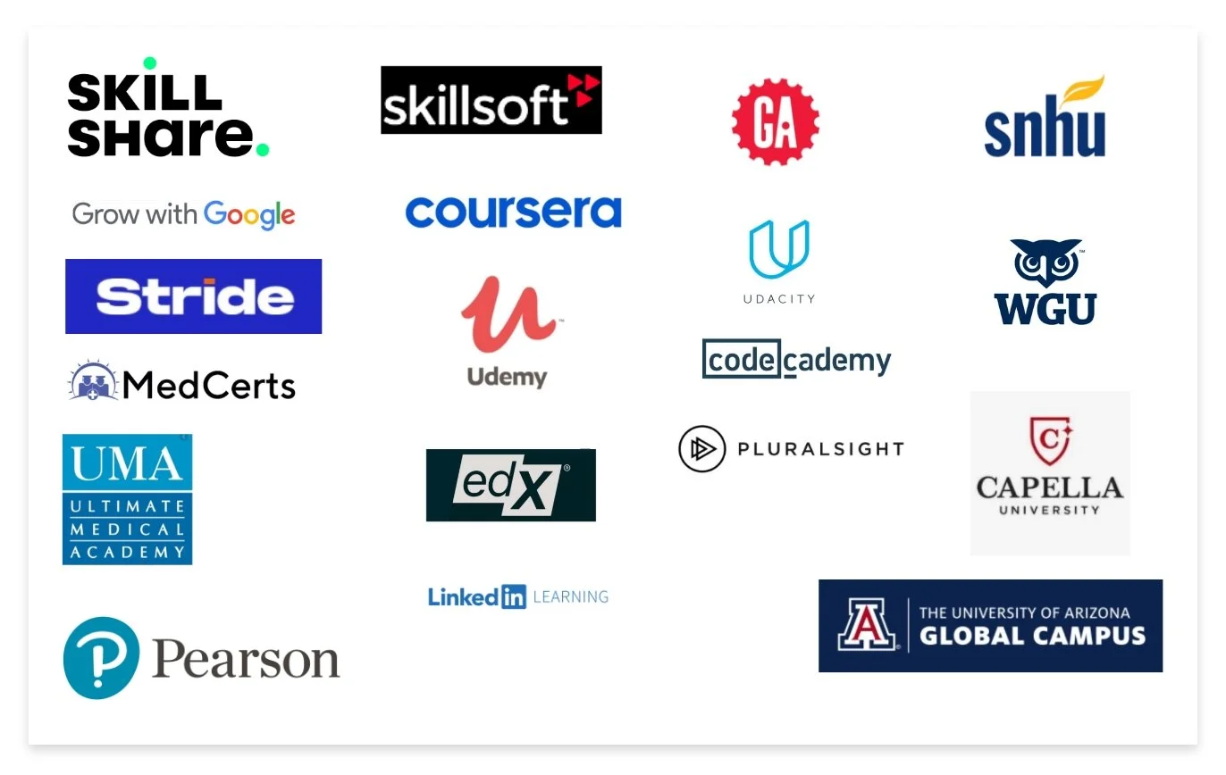
Comparative Brand Analysis
We researched competitive and comparative brands in the higher education, edtech, and eLearning industries to identify visual trends, positioning opportunities, and differentiation strategies. This analysis informed our stylescape development and helped us avoid category clichés.
Design Validation: User-Testing Four Visual Directions
After the research phase, the team gathered their "ingredients"—brand attributes, persona insights, and competitive analysis—and began translating strategy into visual concepts. I introduced the team to stylescapes, a design presentation method that conveys visual direction through carefully curated mood boards that combine imagery, typography, color, and texture. This approach allowed us to explore multiple directions efficiently while teaching the team a valuable client presentation technique.
Design Inspiration
Each designer was assigned a set of brand attributes and built an inspiration board to establish a visual direction. This collaborative approach developed team members' strategic thinking skills while generating diverse creative concepts.
Color Palette

Penn Foster's new brand color palette was defined in parallel to our brand work through the UX/UI team's website redesign process. We collaborated closely to ensure the colors would work across both brand marketing and product design applications.
Stylescapes
Concept A: Career Confidence
Concept B: Steps to Success
Concepts C: Going Places
Concept D: Building Blocks
User Testing
To validate our designs and inform the executive decision, we conducted user preference testing through Usability Hub. We tested all four stylescape concepts with participants matching our core student demographics:
150 users
Location: United States
Gender: Male & Female
Age: 18 – 40
Education Level: some high school – college graduate
Employment Status: Student, unemployed, part-time, full-time
Household Income: 40K and under
The results provided clear data on which directions resonated most with our target audience, giving executives confidence in the decision-making process.

Preference test results.
The executive team was impressed with the rigor of our process and narrowed their choices to Concept A: Career Confidence and Concept D: Building Blocks based on both user testing data and strategic alignment.
We were given direction to refine both concepts to facilitate the final decision.
Revision Goals:
Incorporate more of the bold brand colors
Demonstrate logo options in both all caps and all title case
Visualize the brand for both b2b and b2c audiences
Revised Stylescapes
Final Direction
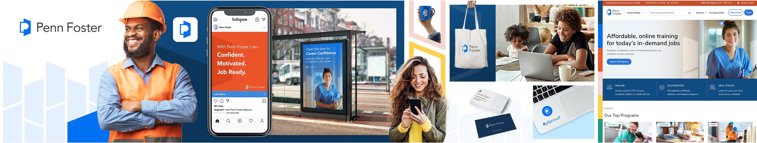
After presenting the revisions and conducting a final stakeholder review, the Career Confidence concept was selected. The team then moved into detailed brand development, creating comprehensive logo systems, brand guidelines, and application examples.
Logo DetailsFinal Logo
Penn Foster Horizontal Lockup
Penn Foster High School Horizontal Lockup
Brand Mark Rationale
Penn Foster Stacked Lockup
Penn Foster High School Stacked Lockup
Impact: Transforming Team Capability and Brand Perception
This rebrand was one of the most challenging and rewarding projects I led as Penn Foster's Creative Director. The success wasn't just in the final visual identity. It fundamentally transformed how our team worked and how the organization perceived our capabilities.
Business Impact
Unified a fragmented brand portfolio following a major acquisition
Modernized Penn Foster's 130-year-old brand to appeal to contemporary learners
Created a scalable visual system that worked across B2B (employer partnerships) and B2C (individual students) audiences
Established Penn Foster as a forward-thinking eLearning leader rather than a legacy correspondence school
Team Transformation:
Upskilled a production-focused team to lead strategic brand initiatives
Introduced new methodologies: Blue Ocean strategy, story mapping, stylescapes, and user testing
Built confidence through a structured, data-driven process that earned executive trust
Elevated the team's reputation from creative services to a strategic in-house agency
Process Innovation:
Implemented a research-first approach that became our standard for major initiatives
Demonstrated the value of user testing in design decisions, establishing it as an ongoing practice
Created reusable frameworks for brand attribute development and persona building
Key Learnings:
The biggest lesson was the power of process transparency. By involving executives in workshops, sharing research findings, and presenting user testing data, we built trust that gave the team autonomy for future projects. I also learned that upskilling works best when embedded in real projects—the team learned by doing, not through abstract training.
If I were to do this again, I would have documented the team's skill development more formally and created a case study of the transformation.